43221 Queen Elizabeth Sixth Form College


43221 Queen Elizabeth Sixth Form College

Friday, 15 April 2011

Final Product


Thie is the first side of my double page spread. In the end I ended up changeing the layout as I wanted one side to be the aarticle and the other to be a full image. I liked the way I had an image of my model just to thr gith of text. I did this so my aidence did know that then it was actually her speaking in the article.

 Here was my second side of my doublwe page spread. As you can see I had a full side of one image of my model. I did this because I didnt want my audience to seem put of my all of the article taking up two sides, other wise I beleive that they wouldnt be attracted to read it.
This is my final front cover of my magazine. I decided to give a sneek peak on what may be featured inside of my article my the images which are shown at the bottom.

Altogether I am pleased with what I have acheived in my final product. Howveer I do wish that I could of taken more time in doing it and actualy getting much more images than what I did get.

Photo Shoot Images

 here I was able to capture the movement of the plug, which my model was spinning about. Here I had to change teh settings of my shutter spead to a high level in order to capture it without it bluring.


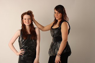
These were a just a few photos in which I took in my photoshoot. As you can see I got a variety of poses with different models in each shot. I wanted to have a good variety of choice, I was then sure that I got the right images for my final project.

PhotoShop cut out tool

Here I used the cut out tool in which I was then able to cut my model out from the background. I will then use this tool in my final product so I will be able to select parts of my images that I may want and which I will dimiss.

Practice Single page Spread


This is my practive InDesign simgle page spread. here I was able to place images into the page without pixulating them. I was also able to create a text box and write text into it, I was then able to edit the font and size of the text to what I wanted.

My Fonts


I downloaded the following fonts for different reasons
Journal
I downloaded this one because It kept a very girly style going on in my magazine. I believe that it looks as though it’s free and swirly. This then helped to keep my project aimed at my target audience.
Halohand letter
Again I choice to download this font because I believed that  I  this again kept to the attraction to my target audience. 
To get my fonts I downloaded them from dafonts.com. I first had to download them from the website and then extract the files. It order for them to appear in phoroshop or InDesign I had to then transfer that file into a folder (allocated on my computer) called FONTS. This then allowed me to access these fonts onto my work.

Tuesday, 22 March 2011

Weekly Production Monitoring Blog 22.3.11

Last week I was able to achieve getting my background to be pinker towards the end in the corner, so then when I did my headline it wouldn’t disappear. I also was then able to get my headline written and downloaded a file/ font. This was called ‘riesling’. I was also able to pick a font out for one of my subheadings. This font was ‘Poplar Std’ . here below is the progress I have made so far on my front cover.


You can also see that I have been able to produce a bar code in which I have placed in the bottom left hand corner. From my research I found that this is where most magazines place them .
For the remaining of this week  I wish to get started on my double page spread, deciding the colours and fonts. Also hopefully to complete the basics of my front cover. I will also be taking photos on Thursday 24th so on Friday I will even possibly start editing them then.  Some problems I may occur while doing this week is again unable to do some things on Photoshop. Hopefully things will go smoothly with my photoshoot and I will get some photos.


Weekly Production Monitoring Blog 15/3/11

Last week I achieved the ability to be able to change my background to a different colour whilst giving it an effect of fading into a different colour. I was then able to understand how to download and save different fonts and get them into Photoshop and InDesign.  
I was also able to plan out my double page spread sheet in InDesign. So my skills in InDesign have progressed as I am not able to plan out what my double page spread will look like and how to actually achieve this.  I didn’t really have any problems only the small fact that I wasn’t too sure as too how to use InDesign at first but after a quick chat with Steph I was sure to complete it.
This week I wish to properly start my double page spread or even my front cover.  Possible get the headline done and written out and even editing. Some problems  may occur with this is the fact that I may not know how to do some things in Photoshop as of that I will need to ask for some assistance. If i am unable to solve my problems then I think I will have to go with a second option.

Thursday, 3 February 2011

Side & Full Lightning

                              Side and Full Lighting Shots                                


As you can see here I was able to catch the light which was coming from the right side of this model. And on her left side it is darker.

Here these pipctures were taken outside, so I had to get in a position in where I knew the lightning would be correct. As you can see that the natural light is coming mroe from my models left hand side than her right
You can clearly see the difference here in the lightning.
This I find is a good shot as you can clearly see the difference in all of my model. she is much darker on her left than she is on her right

This is side and full lightning, meaning you are able to capture light in which you can capture from different angels.

Monday, 15 November 2010

Shutter Speed Shots

Slow Shutter Speed
Here we set the camera on a speed of 3.2. Unfortunatly we had some trouble with our camera and were only able to capture this one photo.

 Fast Shutter Speed
On these photos we set the camera to 200. this aloud us to be able to capture a movement as it freezes whatever to movement is, and it is able to give you a percise picture.

This photo demonstrates Clara doing a cartwheel. I have been able to capture Clara in mis air without any blurs in it.
In this I have been able to capture Clara jumping and throwing leaves in the air
Again with this one shows Clara mis air jumping throwing leaves.
In this photo I have been able to capture Claras facial expression well while shes jumping around.
This shows plenty of leaves being scattered about and I hafve been able to capture every leaf there.

Wednesday, 29 September 2010

Introduction Project


As Media Production: Induction

In this project the product that I used was Crab Paste. At first my group had some trouble deciding on how we were going to make Crab Paste seem appealing to any audience whatsoever, as it’s not a very appetizing product. In the end though we came to a conclusion and we now have a finished story board and Print.
Throughout this project my skills have developed in my use of photo shop. Before this I had never been on photo shop, and I am now capable of creating a background, change colour font and sizes. I am able to resize photos without losing the pixel. Unfortunately I am still unable to do a majority of tasks but I would like to think that my skills will develop throughout the year. One of my weaknesses in photo shop is being able to crop out a certain part of an image. I would like to think that I am progressing as I find that my strong skills in photo shop are progressing. I still have to learn more about photo shop, but I am quite positive that I will be able to come to terms with each tool, and my pieces of work will be a lot better. Altogether I think I still need my skills in using each tool to progress.
In conclusion we first decided to aim our project at gay males, but when given out project we thought decided that this may be too hard and complicated so we came to a agreement to aim it at straight males. We were going to aim our product at 16 – 19 year olds, who are in further education and still live with their parents/family.  Before we rebranded Crab Paste, its original audience was for adults who live either with or without a partner. It was designed to be cheap, so any social economic group could buy it.
I think the main element in my work that work best was the story line. I think it was good to use crab paste as an attraction to girls, making boys buy the product just to get the girls. Our age group was 16 – 19 year olds, and at this time boys and girls tend to sexually active with each other. So this was the main reason why we used Crab Paste to be an attraction. I also thought the my text for ‘Out with the old... In with the new’ worked well, as I changed the font for each statement to make it seem as though having Crab Paste can change you and get the right girl for you-self. The element in which I don’t think work was the font i used for the title ‘Crab paste’ as I thought it looked to be too bold for my page, it also made my Print look a little over crowded and messy I thought.
If I was to do my project again, I would like to be more prepared and know what each part of my story board would be. Unfortunately we wasted a lot of time, trying to come with a new idea of where to sit instead of the grass. So we should have had a backup plan for this problem. Maybe we could have possibly come prepared with a blanket for everyone to sit on. I would change the way I did my print altogether. I would have a different background/ main image.  I wouldn’t have made my Print look so crowded and made it more simple and understandable. I would of taken more time as to where I took my photos, as in the background you can see a woman pushing a pram. And in my pictures of my story board someone has a camera situated next to him. This unfortunately makes the picture seem less believable. It’s hard to see the actual story going on in my story board, as the main girl is meant to walk away from her boyfriend and go to the guy who has the crab paste. Disappointingly this is hard to see, so if I were to do it again I would make the models be more believable, and make the storyboard seem more obvious and understanding.
Unfortunately I find that my final idea can be seen as a bit girly, as its setting was in the park, and my Print seems a bit too loved up. The majority of 16 -19 year old guys may won’t be looking for love as they are young and just possibly want to go out to have some fun. If I were to improve my project to make it seem more interesting to 16 – 19 year olds, I would make Crab Paste seem as though it won’t make you fall in love, just get a girl you may like and have fun. I would change the colours I used to be more masculine, and more appealing to my audience. I also would have done more editing to my image to make it seem less loved up.
In this project you can see that I know how to attract different social groups as I used Crab Paste as an attraction for guys to get the girls. This evidently shows that I understand that girls and guys want to get together because of their age group.
In conclusion I would like to think that over the past week on using my skills on photo shop and using a camera. I will like to think that at the end of this course they would have progressed into much a much higher ability.