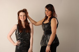
Thie is the first side of my double page spread. In the end I ended up changeing the layout as I wanted one side to be the aarticle and the other to be a full image. I liked the way I had an image of my model just to thr gith of text. I did this so my aidence did know that then it was actually her speaking in the article.
Here was my second side of my doublwe page spread. As you can see I had a full side of one image of my model. I did this because I didnt want my audience to seem put of my all of the article taking up two sides, other wise I beleive that they wouldnt be attracted to read it.
This is my final front cover of my magazine. I decided to give a sneek peak on what may be featured inside of my article my the images which are shown at the bottom.
Altogether I am pleased with what I have acheived in my final product. Howveer I do wish that I could of taken more time in doing it and actualy getting much more images than what I did get.


